PANTONE 11-4201 Cloud Dancer: The Color Palettes
14/07/2026To help you bring the Pantone Color of the Year 2026, PANTONE 11-4201 Cloud Dancer, into your designs, we created seven color palettes featuring this year’s special shade. Each of the palettes conveys a distinctive feeling and mood and easily crosses fashion and accessories, beauty, home interiors, industrial design, and graphic and multi-media design applications. Within each of these seven color stories we also included suggested color harmonies, all of which you can download and share using Pantone
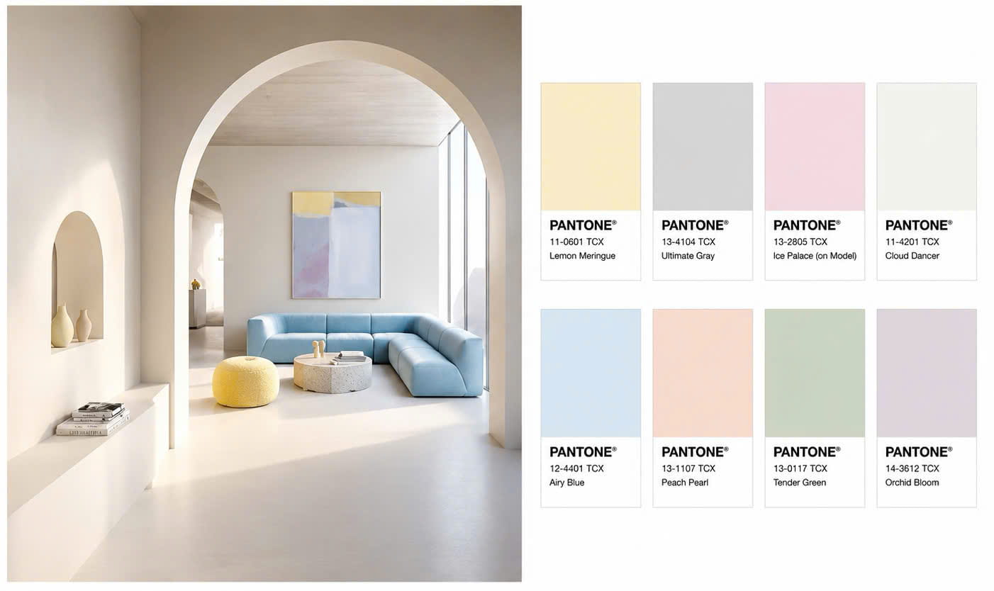
1. POWDERED PASTELS
Pastel and neutral tones make compatible combinations to Cloud Dancer, offering subtle shifts in hue that are nuanced, pleasing, and understated.
2. TAKE A BREAK
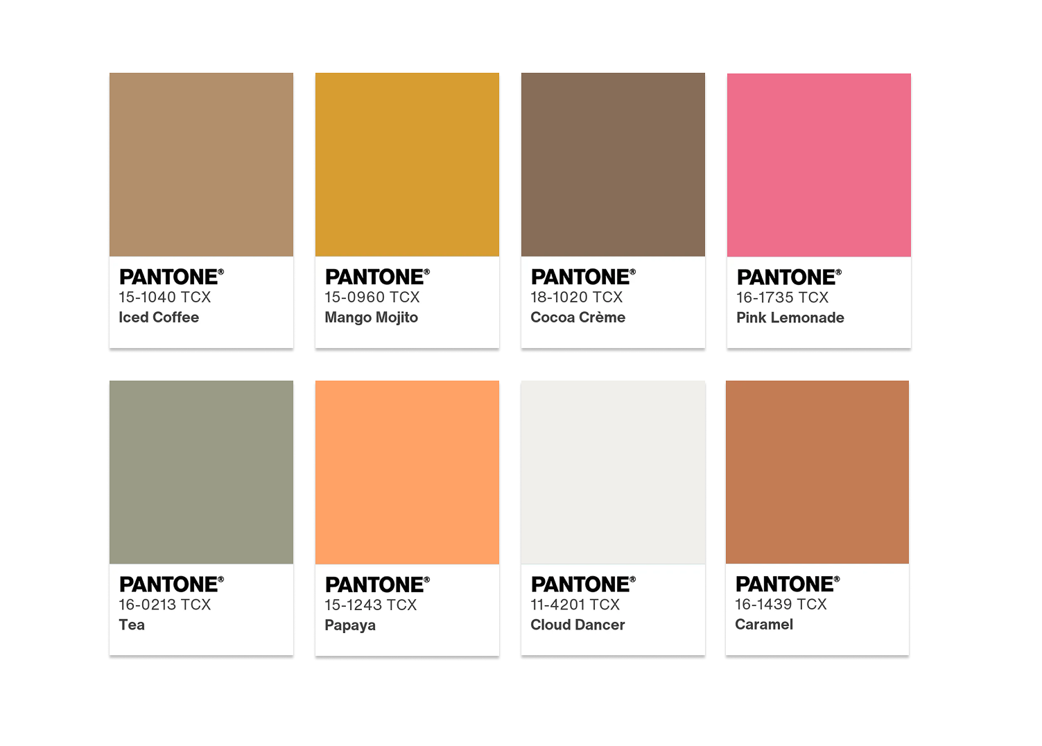
Inviting us to take a break, Cloud Dancer tempts us to taste a variety of hues in whatever shade moves us; a fizzy Pink Lemonade or Papaya, delicious Caramel or Cocoa Crème, or a sip of Tea or a Mango Mojito—all making for a playful palette.
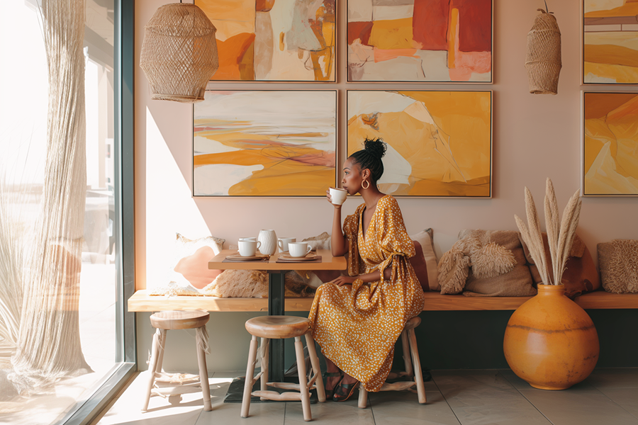
3. ATMOSPHERIC
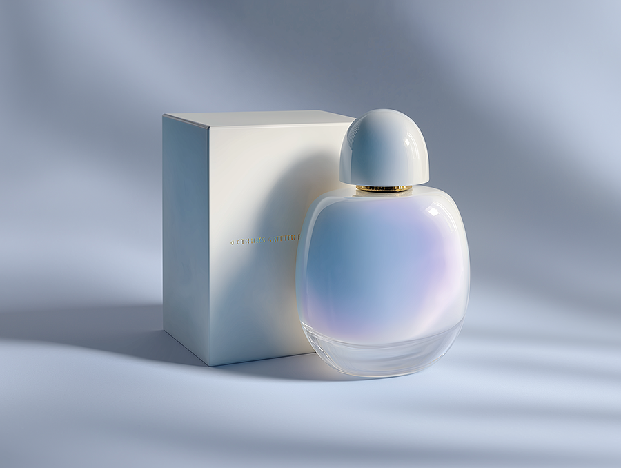
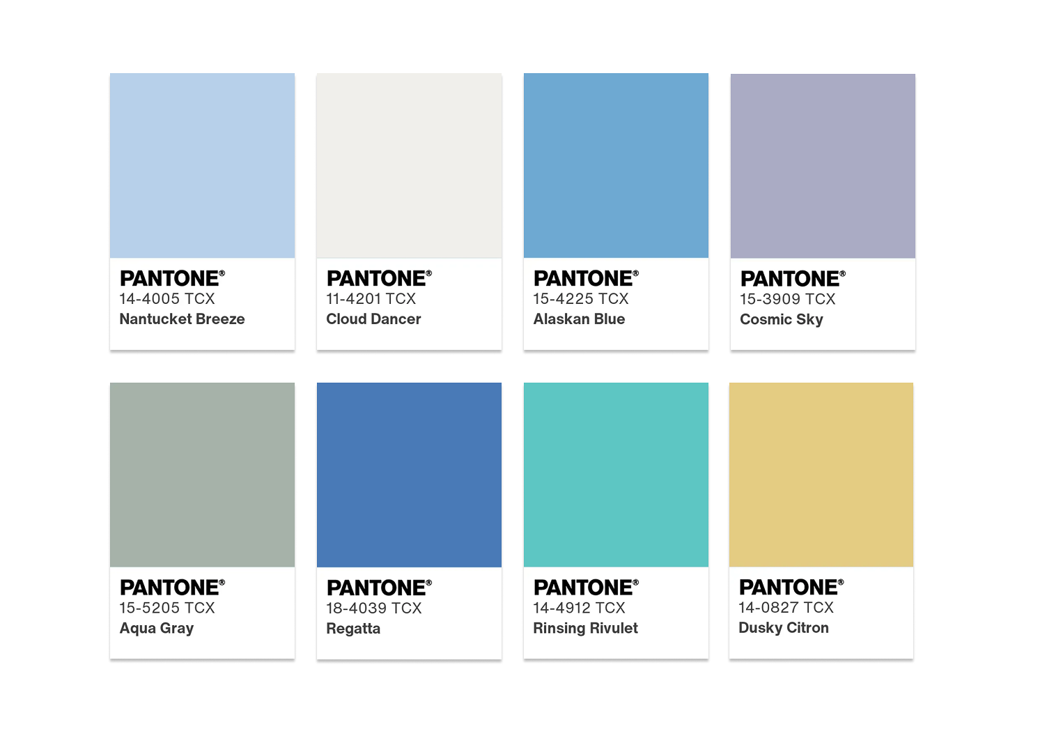
Cloud Dancer lifts us to lofty heights where this diaphanous white breaks through gray skies revealing clear, breezy blues under a misted sunlight. Aqueous blue-greens emanate from the watery depths.
4. COMFORT ZONE
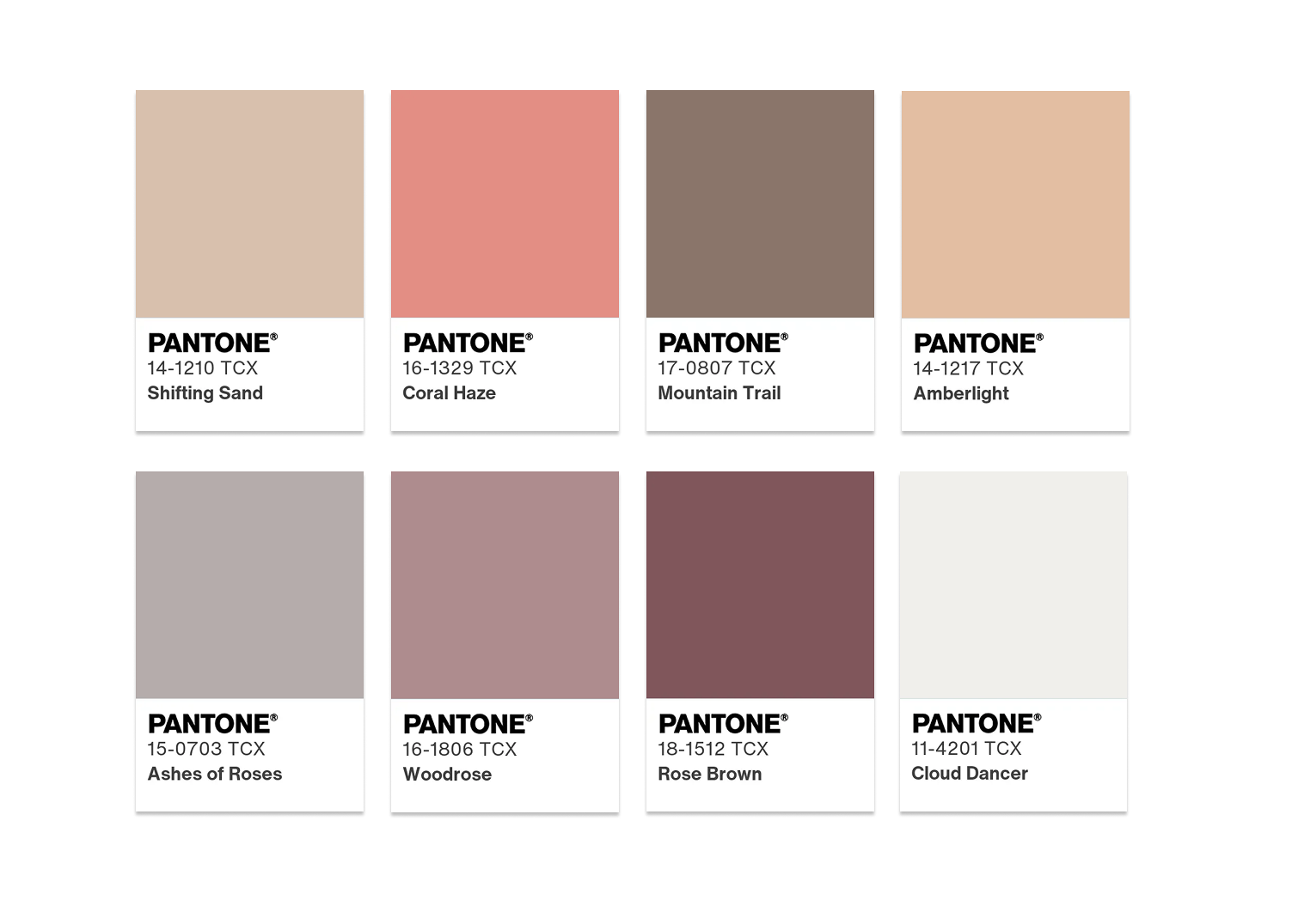
Everyone needs a comfort zone, a place to disconnect, to unwind and de-compress. The natural and organic colors surrounding Cloud Dancer are embracing and inclusive, rendering a sense of reaffirming repose.
5. TROPIC TONALITIES
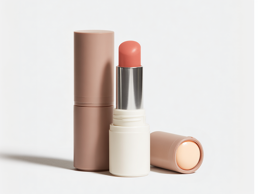
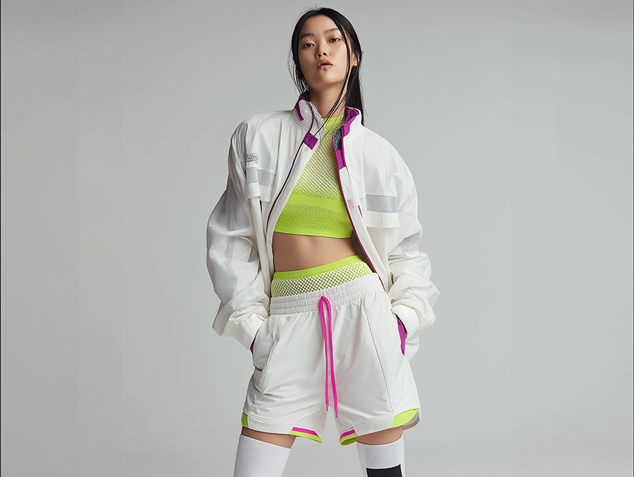
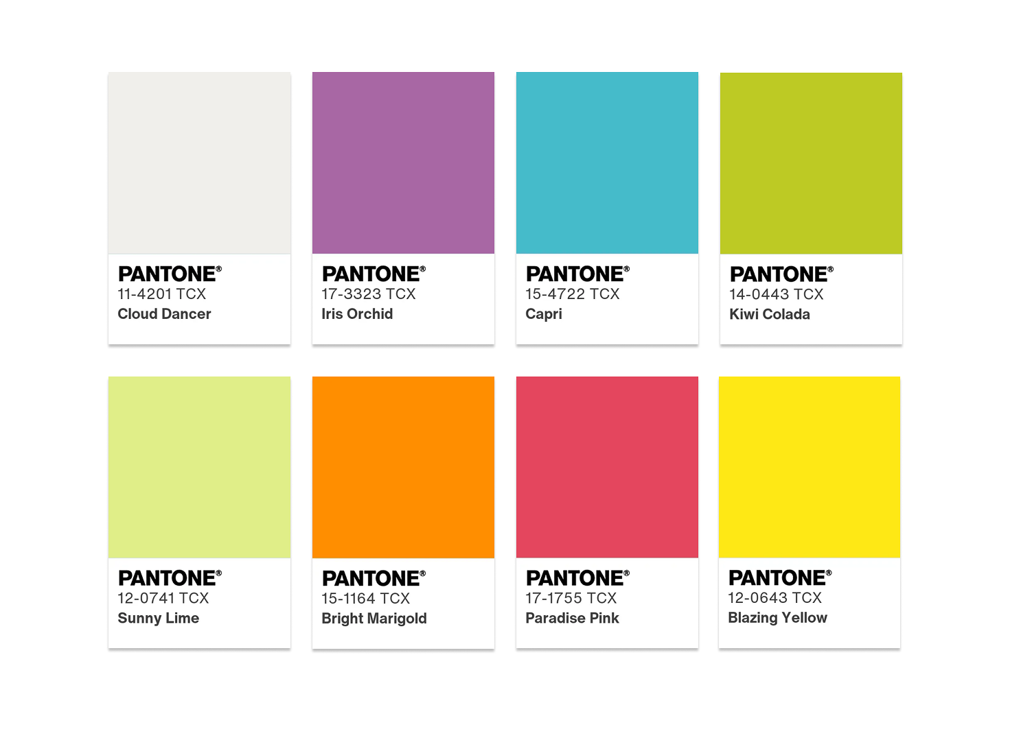
When we imagine the tropics, vivid colors come to mind; a turquoise ocean, sparkling citrusy refreshment, bright florals, and exotic birds. If there is a cloud in this sunlit paradise, it’s a billowy and buoyant Cloud Dancer.
6. LIGHT & SHADOW
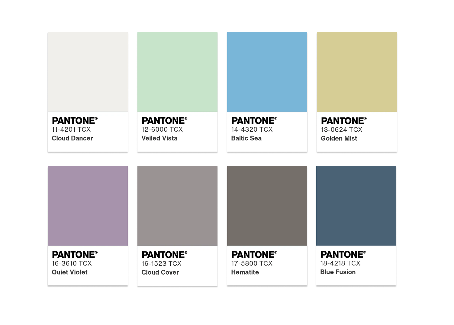
Cloud Dancer gracefully blends into a veiled palette of softened hues that ultimately dissolve into shadowy shades, producing an easy and effortless contrast in color.
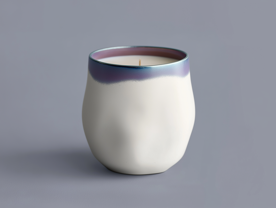
7. GLAMOUR & GLEAM
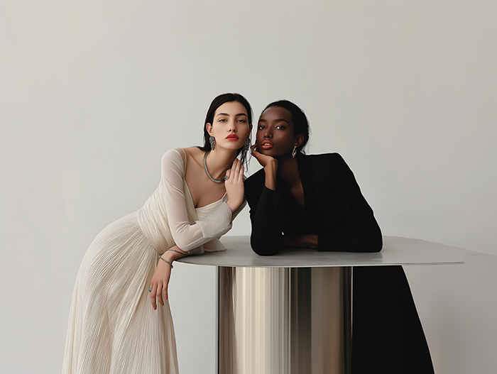
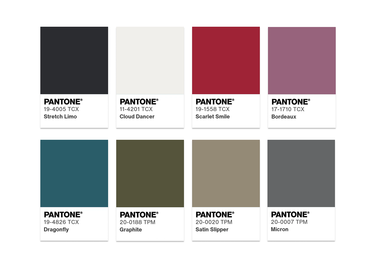
The yin of white inevitably meets the yang of black, accented by a sultry lipstick red. The glamour is heightened by vintage wine and teal, glimmering graphite, shimmering gray, and a silvery satin metallic.